

Beyond Fairness: Deconstructing Graphic Manipulations In South Asian Communities
- Sristhi Bhatia
- Nov 14, 2023
- 2 min read
In the intricate world of graphic design, the influence on consumer behavior is far-reaching, and this blog is a deep dive into the insidious tactics employed by skin whitening cream advertisements, with a special focus on Fair & Lovely and its counterparts. The deceptive graphic manipulations not only perpetuate harmful beauty standards but also contribute to a broader conversation on societal norms, particularly in South Asian communities. Fair & Lovely strategically taps into the Bollywood industry, leveraging rising female actresses to promote its products, aiming directly at a culturally sensitive audience associating fair skin with societal acceptance. This blog uncovers the clever graphic design strategies and positive testimonials employed by the company to build trust and drive sales, despite the controversies surrounding such products.
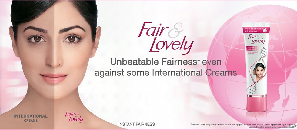
Delving into the historical context, the article highlights the evolution of fairness ideals from American and European concerns to the pervasive impact on Asian societies. The staggering consumption statistics underscore the need for a critical examination of the societal mindset that still values fair skin as an emblem of beauty. The blog critically analyzes a Fair & Lovely ad, uncovering subtle graphic nuances that reinforce the biased narrative. Details like color placement and text manipulation play a pivotal role in accentuating the perceived contrast between complexions. Even the positioning of hair is strategically used to perpetuate damaging stereotypes.
For example, a text not everyone sees or focuses on is the faded print on the left side of the actress which alludes to illustrate a before and after, whereas in reality, it is actually a comparison between Fair & Lovely’s product with other skin whitening brands. It is shown in this ad that there is a clear difference between the skin colors of the split face, but in addition to that what the average consumer does not notice is that one side of the face is near pink while the other side is next to white. This emphasizes which again makes both sides look visually polar aparts or as they could call one side compared to the other, “more lovely”. Every detail counts in this image. Even the fact that there is more hair covering one side of the face than the other is an important factor.
Amidst this analysis, the article introduces the work of artists like Srishti Guptaroy, who employ satire and art to challenge conventional beauty norms. The blog underscores the importance of self-awareness and personal expression in countering societal pressures. It advocates for embracing individuality, fostering a positive self-image, and recognizing the diversity of beauty beyond manipulated graphics. As Fair & Lovely rebrands to Glow and Lovely, the essence of the blog extends beyond exposing manipulation to inspire a cultural shift. It emphasizes the power of personal art in expressing individuality and challenging societal norms, promoting inclusivity, and encouraging readers to value their authentic selves, appreciating the diverse beauty that exists beyond manipulated graphics.